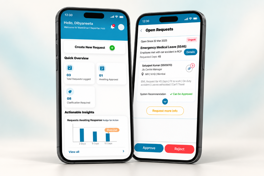
The difficult part was the handoff, not the approval button.
WorkSmart began with a fragmented HR exception process: requests, supporting documents, follow-ups, and decisions moved between corporate and regional teams. My design problem was to keep a request understandable as responsibility changed hands.
As the product designer, my scope covered role-based interfaces, workflow mapping, clarification paths, decision support, and operational completion. I framed the work around three questions: what does this person need to know, what can they decide, and who needs to act next?
- Frame the handoffsLocate where context and responsibility can be lost.
- Map roles and statesSeparate each person’s decision from the request’s status.
- Design the exceptionsCarry missing evidence and responses back into review.
- Resolve the interfaceTranslate the model into request cards, actions, and feedback.
Retrospective summary of the design logic, illustrated by the final design artifacts below.
Structure the request before it reaches a reviewer.
I separated request classification from the detailed evidence form. The design makes category selection the first commitment, then asks for the facts needed to assess that kind of exception.
Tradeoff: A longer intake can feel demanding. Grouping the questions into stages gives that effort a clearer sequence.
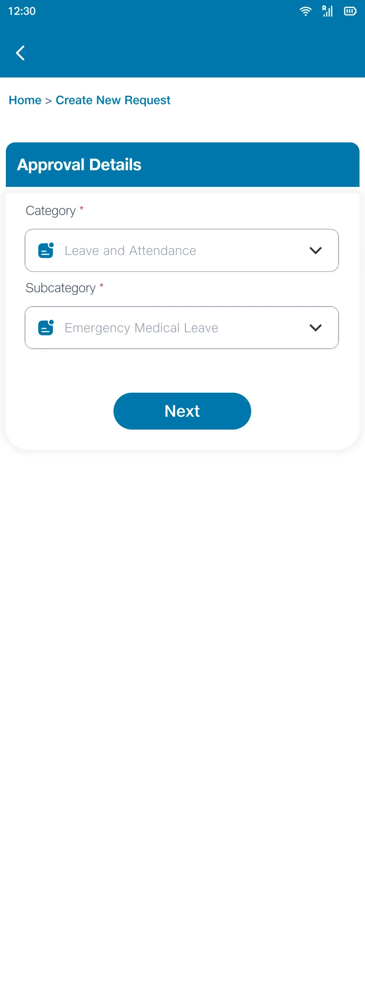
Separating classification from evidence gives a complex intake a clearer sequence.
HRBP - Create new request.pdf · Design artifact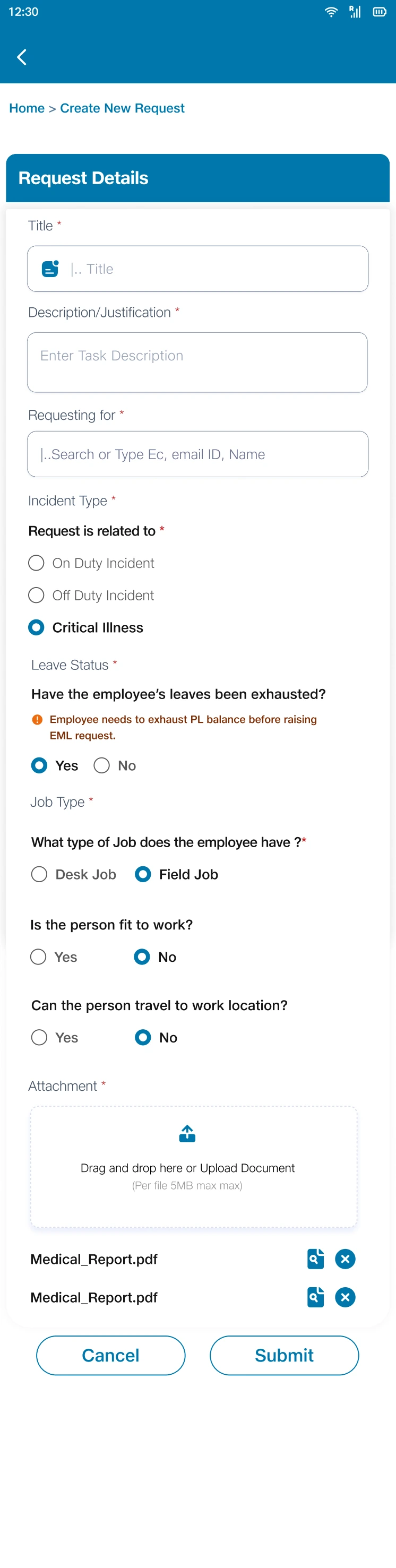
The grouped questions translate the information needed for a decision into the intake structure.
HRBP - Create new request.pdf · Design artifact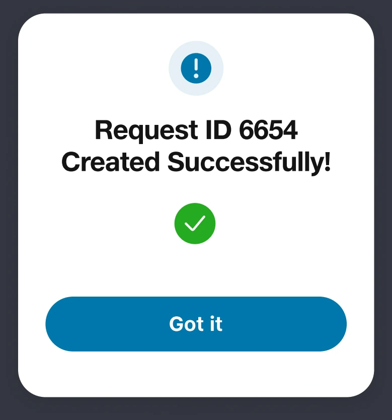
A request ID connects submission feedback to later follow-up.
HRBP - Create new request.pdf · Design artifactSix roles meant six decision contexts—not six unrelated products.
I used role and responsibility mapping to organize the experience. The reporter needs to raise and follow up; the validator needs to check evidence; the approver needs to decide; the Action Owner needs to execute. Request viewers and the central team need visibility without the same decision controls.
The design tension was consistency versus relevance. I kept a recognizable request summary across roles, then changed the available actions and overview information according to responsibility. That preserved context without presenting every control to every person.
Keep the request recognizable; change the action layer.
A validator can assess or ask for information, while the central team can monitor and export. The common record connects those experiences.
Tradeoff: Role-specific views introduce more states to maintain. Reusing the request structure limits unnecessary variation.
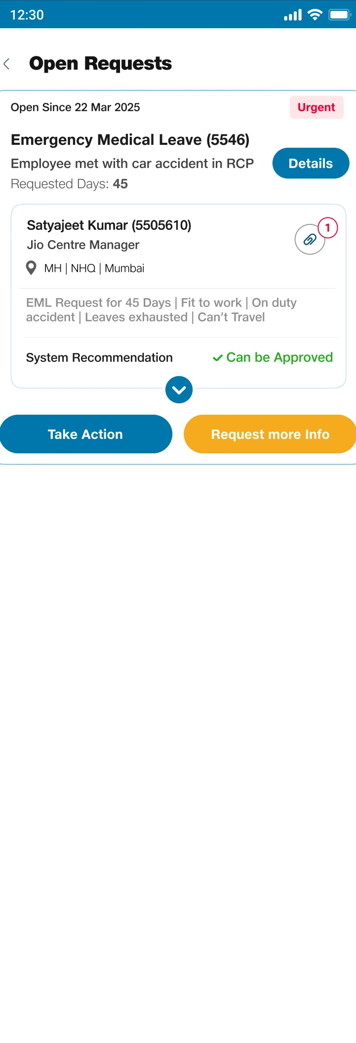
A shared request summary preserves context while the action layer reflects the validator’s responsibility.
Validator Screens.pdf · Design artifact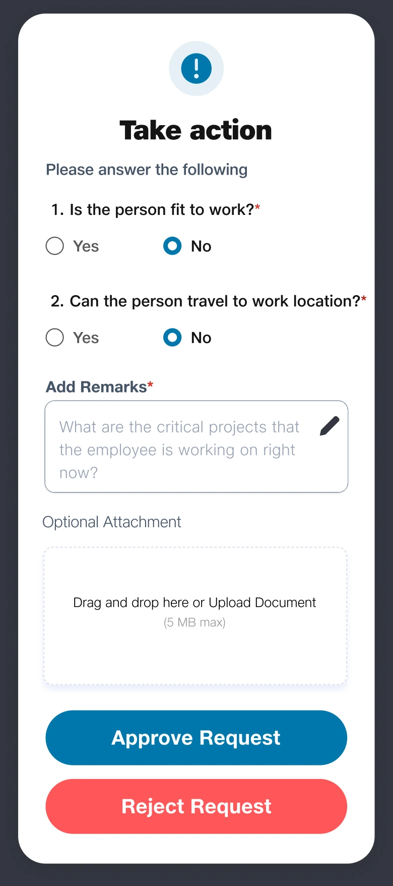
Questions and remarks make the assessment explicit before the decision is committed.
Validator Screens.pdf · Design artifact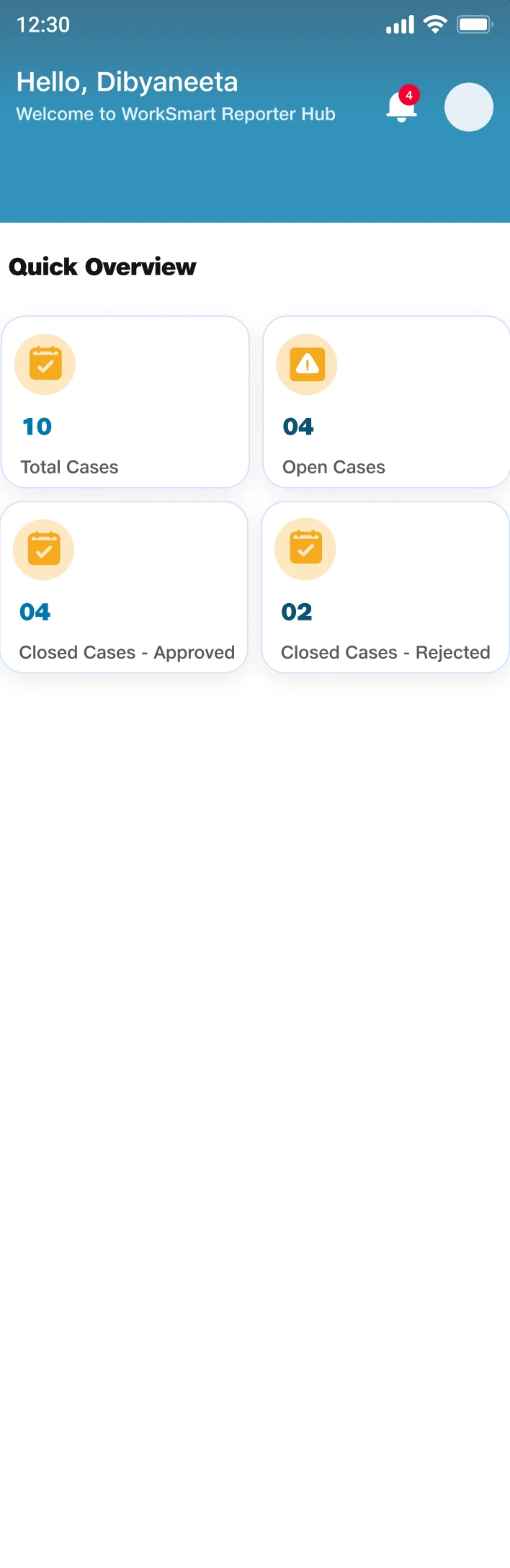
Oversight uses a different hierarchy from review: queue condition comes before individual decisions.
Central team view.pdf · Design artifact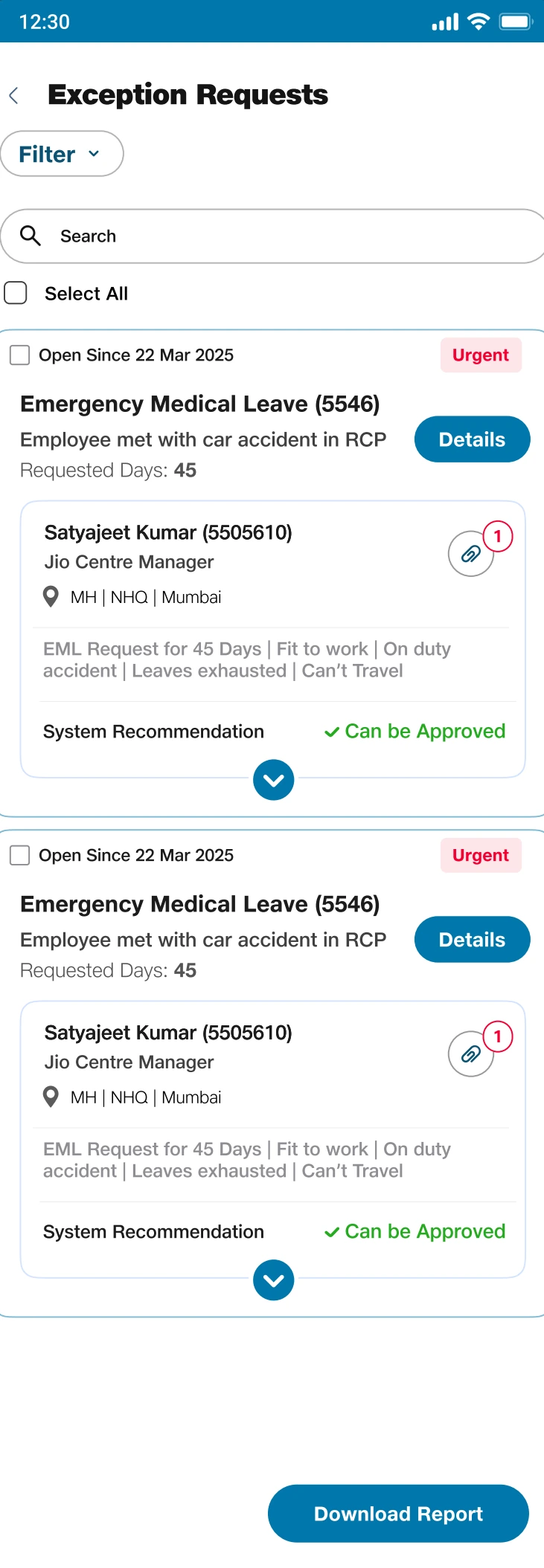
The common request pattern carries through to oversight without importing approval controls.
Central team view.pdf · Design artifactMissing information became a loop I had to design end to end.
A straight approval flow was insufficient for requests that arrived with incomplete evidence. The design needed to preserve the work already done while making the missing information someone’s next action.
I treated clarification as a sequence with four connected parts: a question addressed to a person, a visible response task, a reply with evidence, and a return to review. The original question and received response remain together so the reviewer can recover context.
- AskName the recipient and the missing information.
- AssignSurface a response task in the reporter’s queue.
- RespondKeep remarks and supporting documents together.
- ResumeReturn the evidence to the reviewer’s decision context.
Retrospective summary of the design logic, illustrated by the final design artifacts below.
Preserve the request through uncertainty.
The same request carries the clarification history instead of requiring a fresh submission. This was the central interaction decision in the case study.
Tradeoff: The loop creates more intermediate states than approve or reject. Clear queue labels and next actions are necessary to keep it legible.
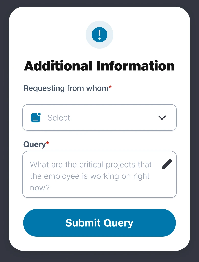
Recipient and query fields make the information gap an assigned action.
Validator Screens.pdf · Design artifact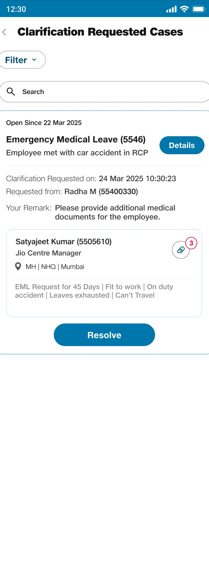
A visible Resolve action turns an outstanding question into a response task.
HRBP - Create new request.pdf · Design artifact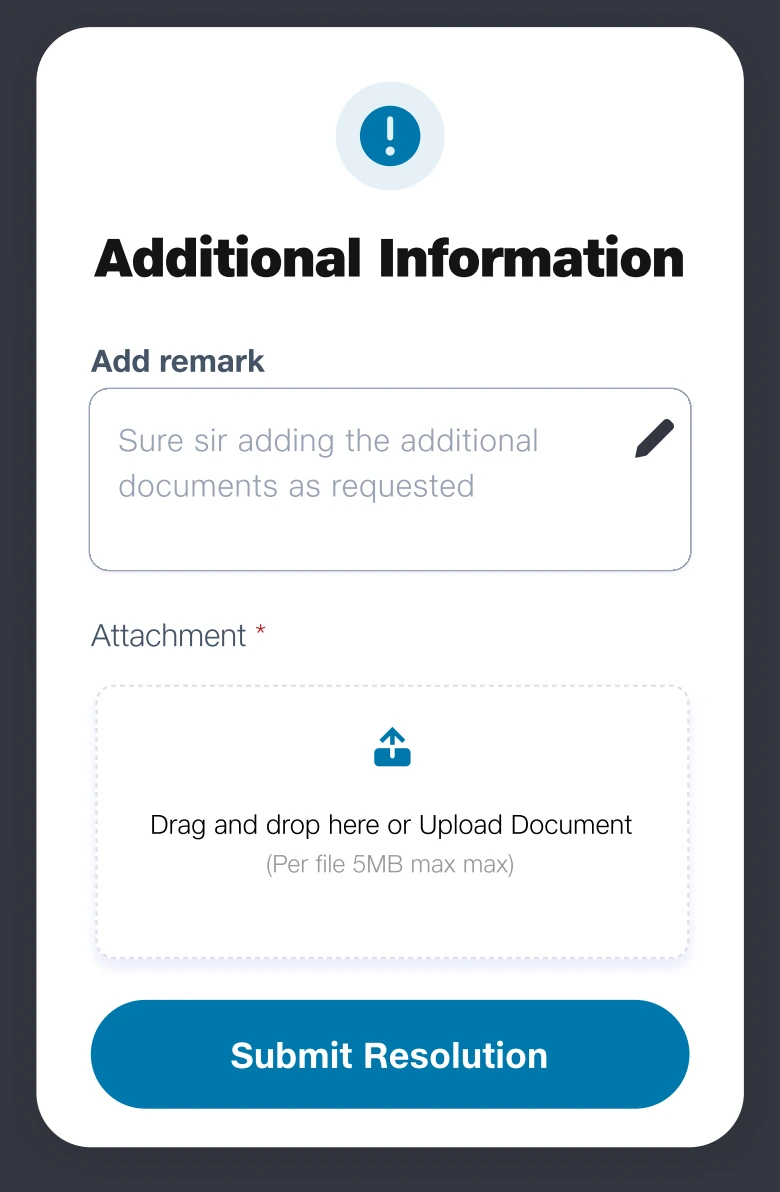
Keeping remarks and attachments together preserves the meaning of the response.
HRBP - Create new request.pdf · Design artifact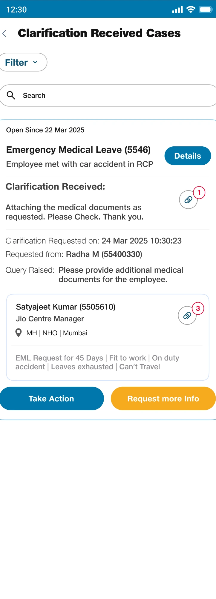
Showing the response alongside the original query restores context at the handoff.
Validator Screens.pdf · Design artifactA recommendation needed context, not visual authority.
The approval screen contains a system recommendation, but the design still has to support a person making a consequential decision. I placed the recommendation with the request facts rather than making it the sole focus of the page.
The hierarchy keeps the incident summary, requested days, leave status, and supporting detail near the decision. Approval, rejection, and requesting more information remain explicit choices. The separate confirmation gives remarks a deliberate place in the interaction.
Make the recommendation one input to a decision.
Visible context and explicit actions preserve the distinction between a system suggestion and the approver’s judgment.
Tradeoff: Additional context makes the screen denser. The summary/detail hierarchy lets the reviewer scan first and inspect further when needed.
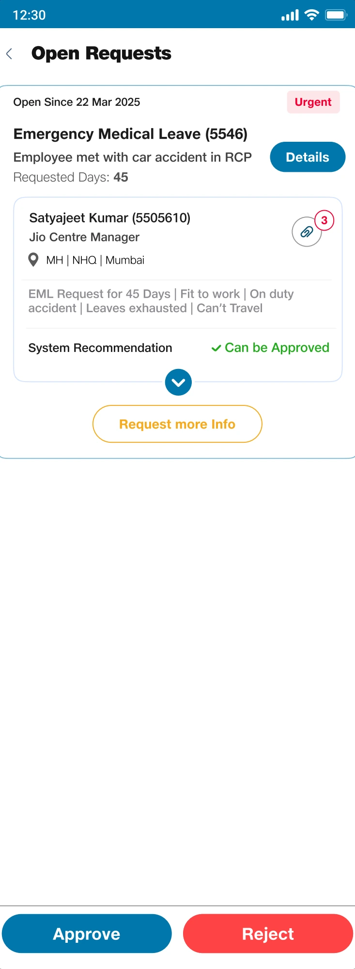
The recommendation is placed with the evidence; explicit choices preserve human judgment.
Approver Screen.pdf · Design artifact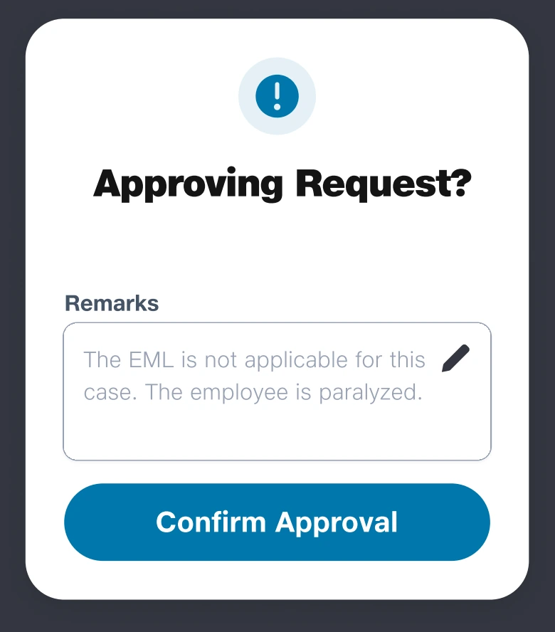
A separate confirmation creates space for a deliberate decision and its remarks.
Approver Screen.pdf · Design artifactI separated permission to act from proof that the work was done.
Mapping the downstream work exposed a crucial distinction: an approval does not itself make the operational change. If the interface treated approval as the endpoint, it would hide the remaining responsibility.
I gave the Action Owner a separate completion action and a confirmation that explicitly asks whether the required changes have been made. The wording, remarks, and success feedback reinforce a different endpoint from approval.
Give operational completion its own state.
The design makes the final handoff visible instead of allowing the approval event to stand in for execution.
Tradeoff: This adds a step for the Action Owner. Its value is accountability; it still relies on the person accurately confirming the work.
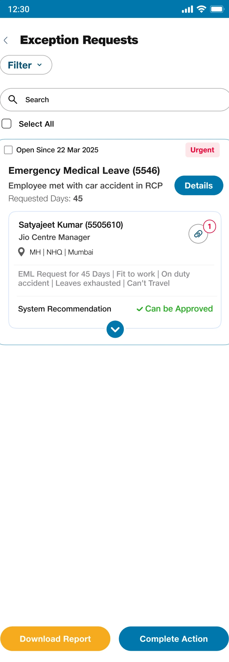
The execution queue makes the responsibility after approval visible.
Action Owner Screens.pdf · Design artifact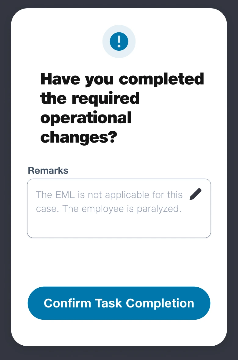
The wording distinguishes an operational change from an approval event.
Action Owner Screens.pdf · Design artifact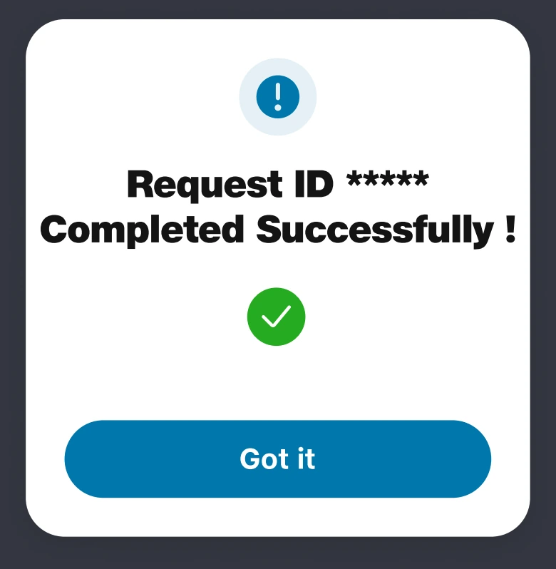
Separate completion feedback reinforces the final state of the interaction model.
Action Owner Screens.pdf · Design artifactA compact summary and a deeper history solved different reading needs.
The request card needed to support quick scanning; the case record needed to explain how the request arrived at its current state. I separated those levels of information rather than asking one screen to do both equally.
The list keeps the request recognizable, while the detail view carries roles, dates, remarks, and clarification events. This is progressive disclosure applied to decision history: enough context to find a case, then enough detail to understand it.
Keep the trail available without loading it into every card.
The expanded history supports continuity when a different person takes over a request.
Tradeoff: Details require an extra navigation step. The summary must retain enough identifying information to make that step predictable.
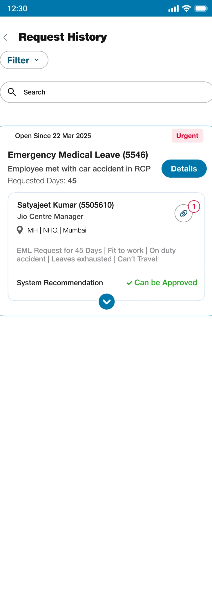
A compact summary supports scanning without exposing the entire history.
Request View for status and latest update.pdf · Design artifact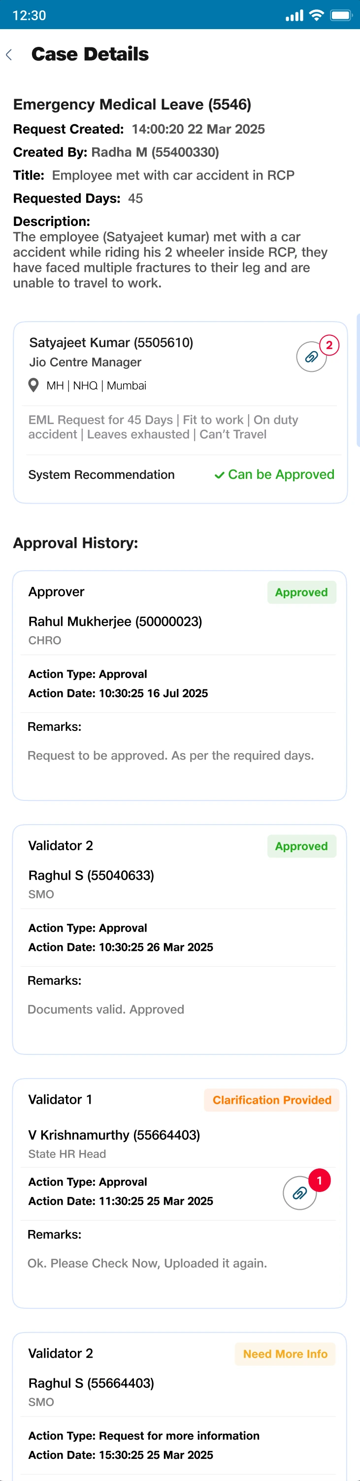
The deeper record preserves the reasoning and events behind the current status.
Request history.pdf · Design artifactThe design had to hold together outside the main flow.
I extended the interaction language to filtering, attachments, and unavailable pages. These states matter because reviewers need to find evidence, reduce a queue, and recover when a destination fails—not only move through an ideal request.
The final design set shows grouped filters with Apply and Clear all, a dedicated attachment dialog, and a recovery action on the error screen. Together they make the supporting interactions explicit enough to carry through implementation.
Design recovery and supporting tasks as part of the system.
Consistent actions and feedback connect these small interactions to the larger request journey.
Tradeoff: A reusable pattern cannot erase context. Filters still need meaningful category labels, and errors need a useful next step.
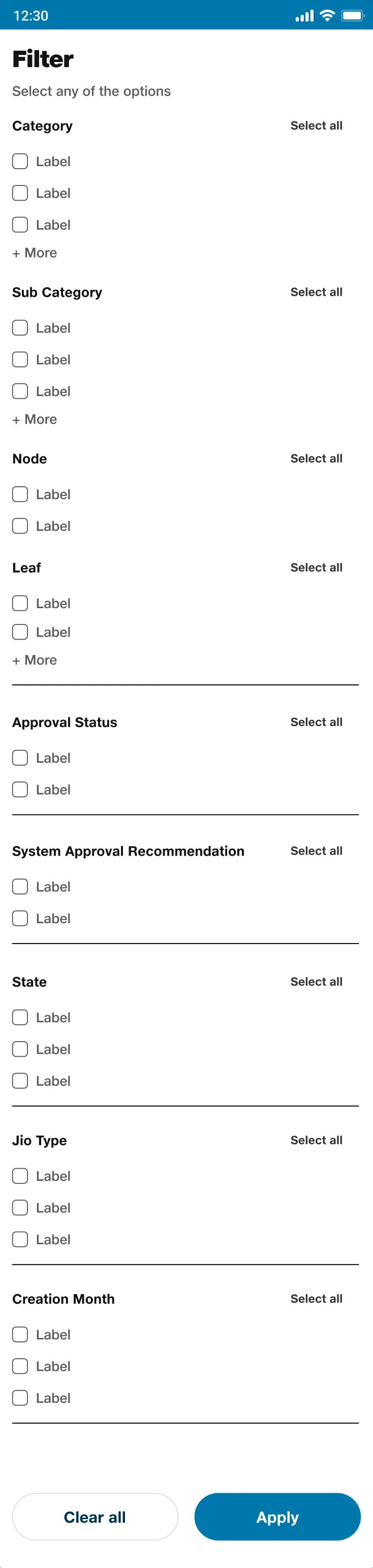
Grouped controls make queue reduction explicit. Placeholder labels remain visible in this source artifact.
Default Filter and Attachment screens.pdf · Design artifact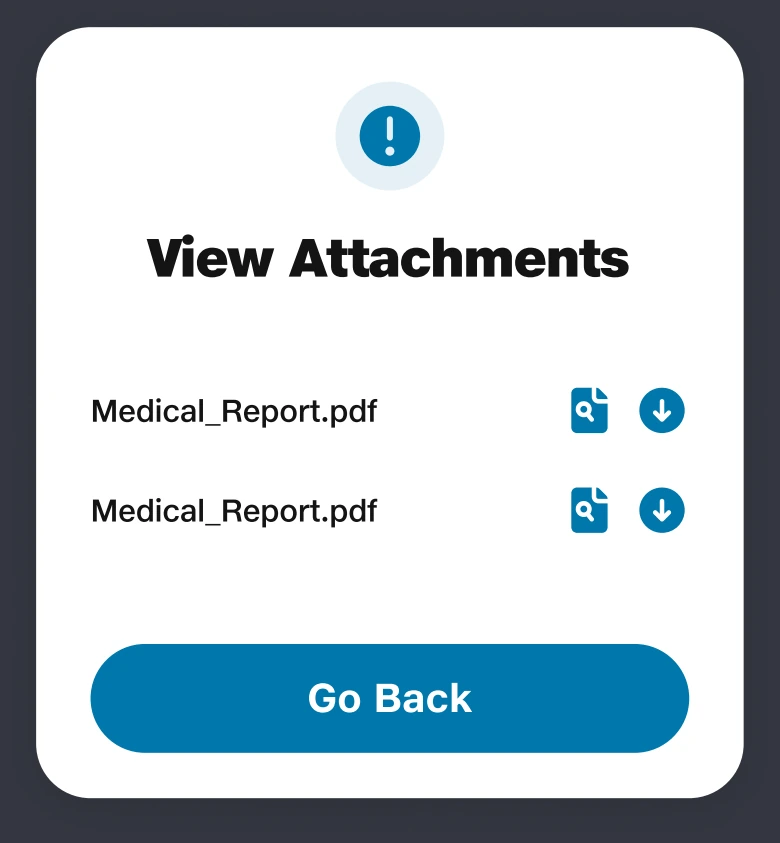
A focused dialog gives supporting evidence its own interaction without crowding the summary.
Default Filter and Attachment screens.pdf · Design artifact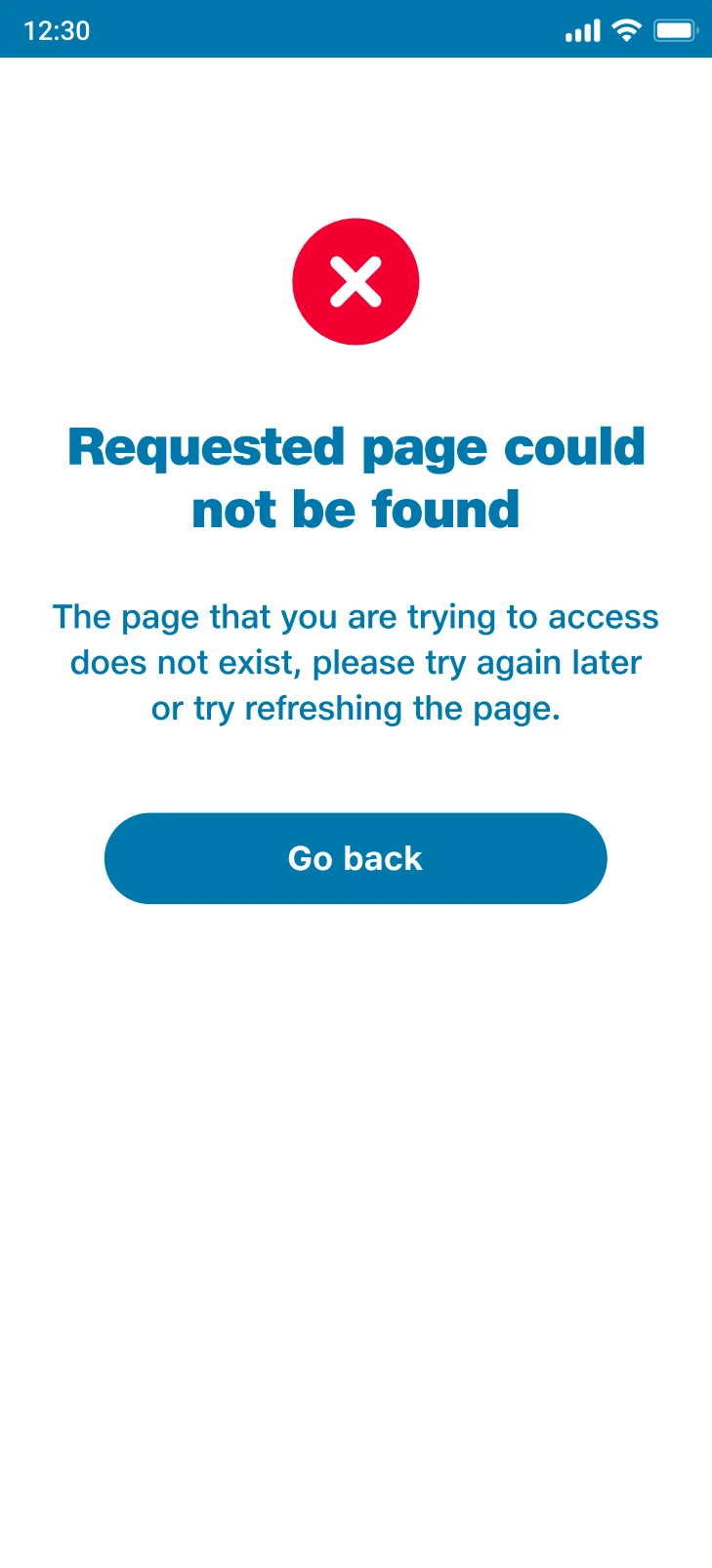
Recovery language and a next action extend the interaction design beyond the successful path.
Error Screen.pdf · Design artifactThe mark connected the person to the task.
The identity exploration considered workplace, collaboration, and checklist symbols. The resulting mark combines a person with a checklist, tying the visual identity to the same people-and-responsibility theme as the interaction design.
The exploration board and standalone mark show this part of the design process directly. I present them separately from the interface decisions: an identity can make the product recognizable, while clarity still depends on the workflow and hierarchy.
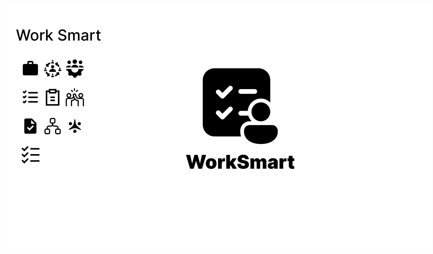
The exploration connects workplace, collaboration, and checklist imagery to the design theme.
Logo Design.pdf · Design artifact
The person-and-checklist mark gives the people-and-task relationship a recognizable identity.
Logo Design-1.pdf · Design artifactMy main learning: design the transitions between people.
WorkSmart was implemented and is used internally at Jio. My contribution was the design structure behind that experience: distinct responsibilities, a clarification loop that preserves context, and a completion state beyond approval.
The final screens demonstrate the interaction model; they do not establish a measured reduction in handling time or errors. I would evaluate those outcomes through clarification turnaround, repeated requests for the same evidence, and the time between approval and operational completion.
The lesson I carry forward is to map uncertainty and handoffs as carefully as the main flow. A clear screen matters, but continuity between screens—and between people—is what makes the design coherent.