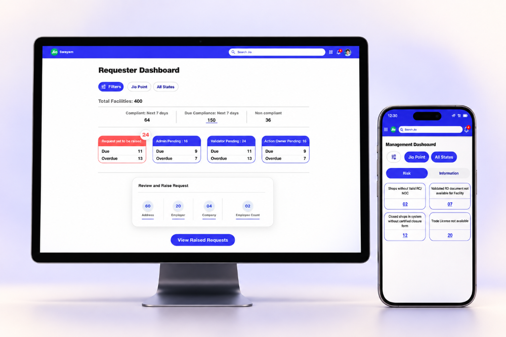
Before I could simplify the interface, I had to model the system.
Vishwas addressed compliance work spread across facilities, spreadsheets, document exchanges, and agency follow-ups. The challenge was not simply moving a form online: the same facility could have several documents, changing business details, and different people responsible for the next action.
My role as product designer included entity modelling, information architecture, state logic, document lifecycles, and risk dashboards. I began with the relationships the interface needed to express: the facility, its company information, its registration documents, and the requests that change those records.
- Model the domainIdentify records, relationships, and change triggers.
- Separate meaningsDistinguish compliance health from work in progress.
- Expose the lifecycleDefine evidence and responsibility at each stage.
- Reflect on adoptionExamine where system logic meets existing work habits.
Retrospective summary of the design logic, illustrated by the final design artifacts below.
Organize evidence around the record it belongs to.
Facility documents and company documents have separate groups. A change request compares previous and requested values, making the relationship model visible in the interface.
Tradeoff: A more precise structure asks people to classify information correctly. The grouping and labels need to make that distinction understandable.
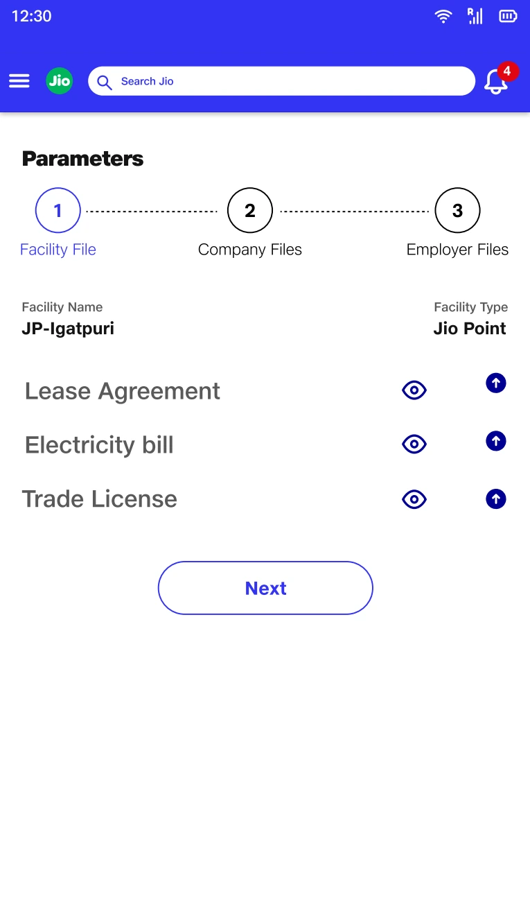
Grouping by facility makes ownership of the evidence explicit in the information architecture.
Dashboard.pdf · Design screen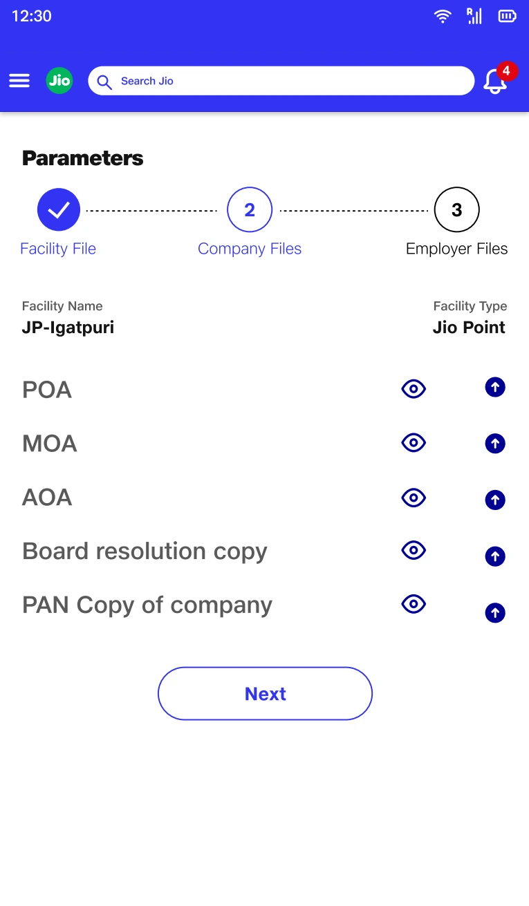
A separate company group preserves a relationship that a flat upload list would hide.
Dashboard.pdf · Design screen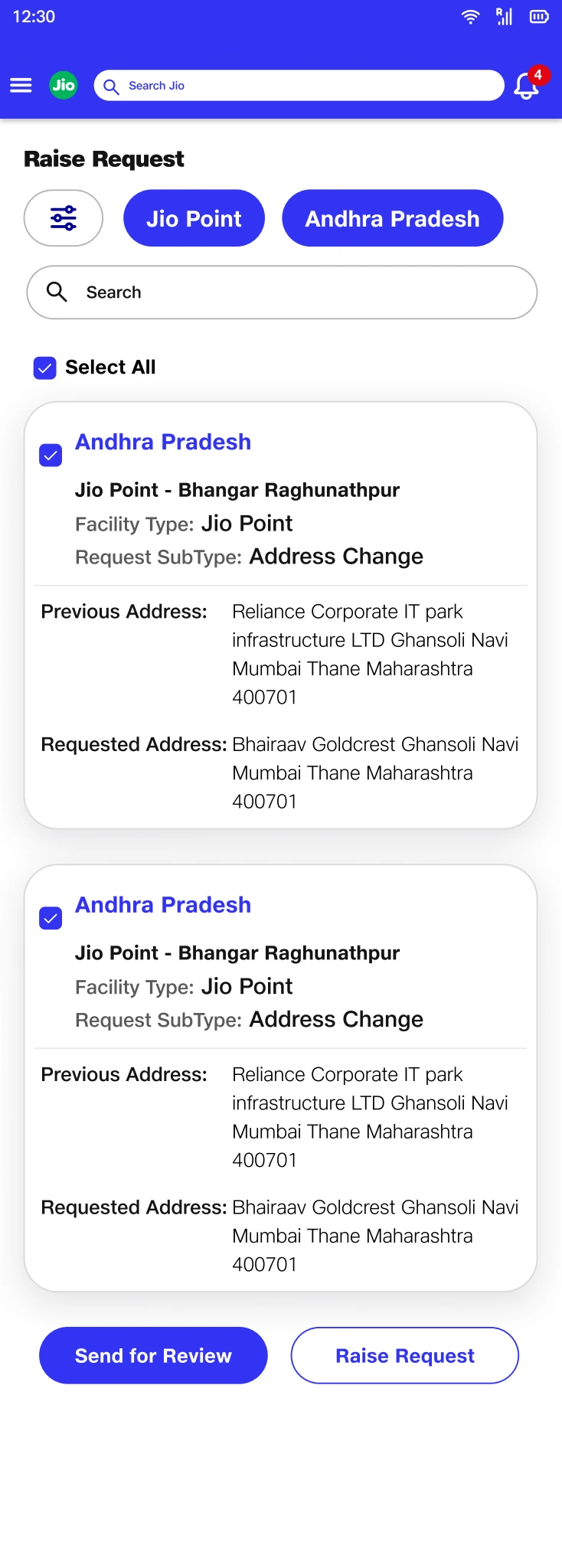
Showing previous and requested values makes the change itself reviewable.
Requestor.pdf · Design screenOne status could not answer two different questions.
The central modelling decision was to separate “Is this facility compliant?” from “Where is the work to resolve it?” Combining them would make an active request look like resolved compliance, or make an unresolved compliance issue look like no one was acting.
I treated compliance condition and workflow progress as separate dimensions. The dashboard brings them into one view without collapsing their meaning: compliance categories describe the condition, while role queues describe who needs to act.
- Compliance conditionCompliant, nearing expiry, or non-compliant.
- Workflow progressRequest creation, validation, action, or completion.
Retrospective summary of the design logic, illustrated by the final design artifacts below.
Show condition and progress together, but label them separately.
A non-compliant facility can have a request actively progressing. The design needs to preserve both urgency and ownership.
Tradeoff: Two dimensions are harder to learn than one status badge. Consistent language and grouping are essential to avoid creating a new ambiguity.
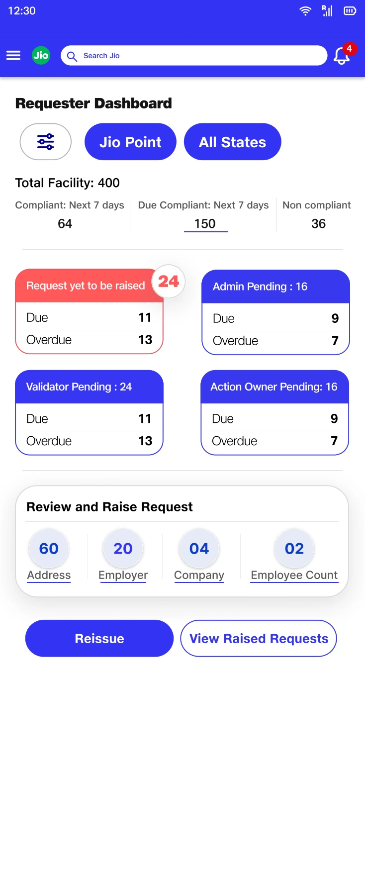
The hierarchy separates compliance condition from queues organized by responsibility.
Requestor.pdf · Design screenThe next step was turning system relationships into reviewable screens.
Once the core records and states were defined, I translated them into role-specific entry points. Request creation, document validation, compliance action, and management reporting needed different starting points while remaining connected to the same facility context.
For review tasks, I brought the evidence and the decision close together. Field-level checks support document validation; grouped registration, facility, and location information supports the compliance decision. The information architecture follows the reviewer’s task.
Make the model visible through grouping, not technical terminology.
The interface expresses the underlying relationships as recognizable sections and checks. This connects the structural design work to the reviewer’s immediate task.
Tradeoff: Detailed validation adds density and effort. Its purpose must be clear at each check rather than feeling like repeated data entry.
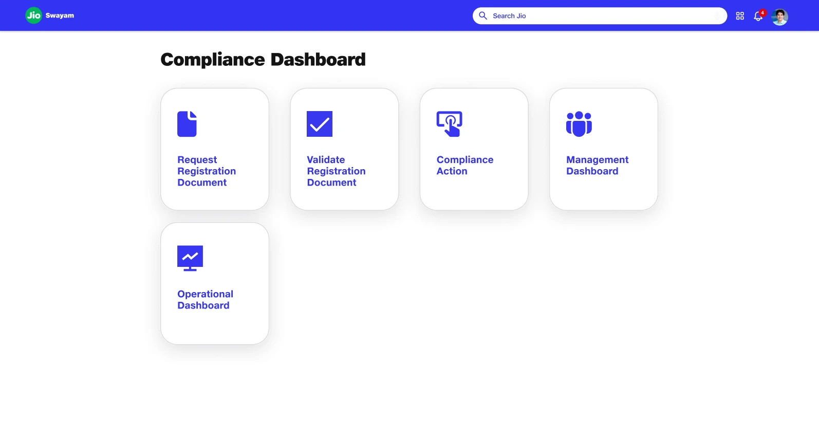
Distinct entry points translate the role model into a navigable starting point.
Presentation.pdf · Design screen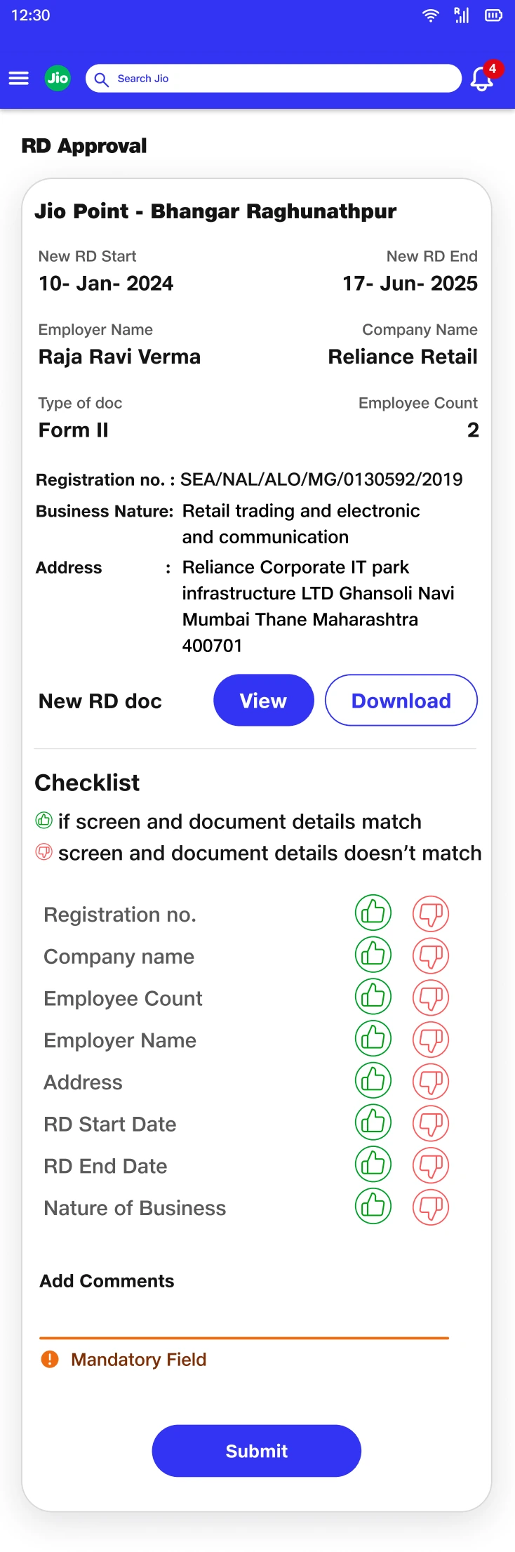
Field-level checks connect the evidence to the validation decision.
Validator.pdf · Design screen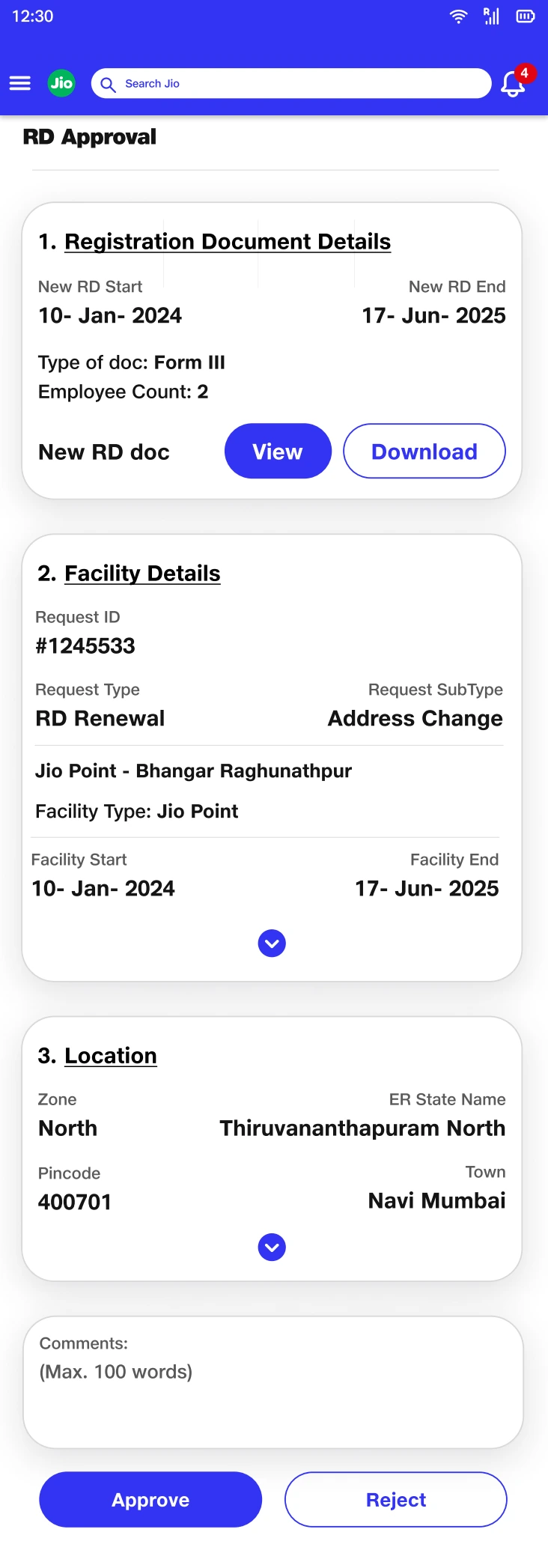
Grouped record details carry the domain model into the approval context.
Compliance Validator.pdf · Design screenAn uploaded file was not the same as completed compliance work.
The document lifecycle introduced another distinction: having a file, judging it adequate, filing an application, and receiving a registration document are different events. I separated those events in the design so that progress could not be implied by an upload alone.
The action-owner workspace makes the sequence explicit. Document review precedes filing; a receipt records the filing event; final document details complete the evidence. Rejection retains a reason and a route back to action.
Use evidence to explain each transition.
The staged design ties the next action to a concrete condition: a usable package, filing evidence, or the final registration document.
Tradeoff: Explicit gates make the workflow longer. They are useful only when each one corresponds to a real operational distinction.
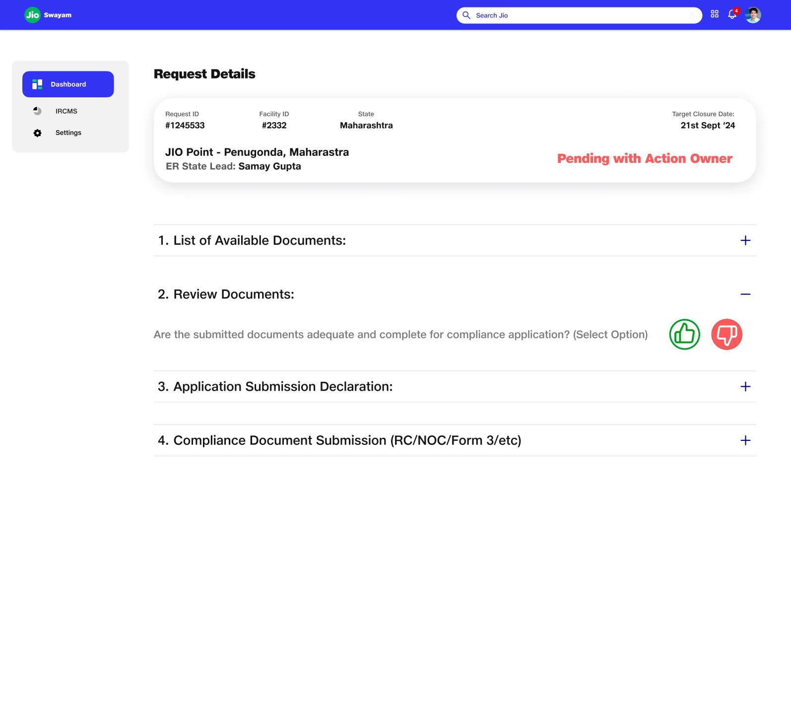
The staged workspace exposes the difference between review, filing, and final evidence.
Action Tile.pdf · Design screen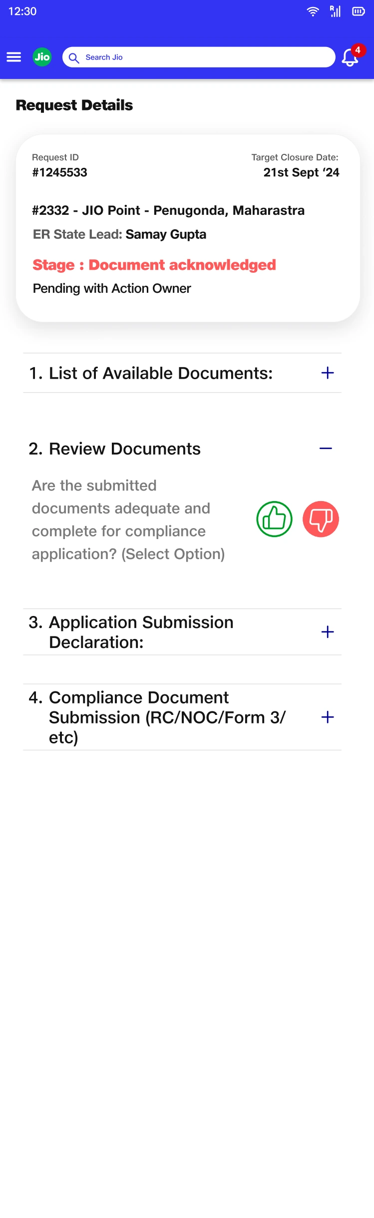
The adequacy decision prevents file availability from implying readiness to file.
Action Owner.pdf · Design screen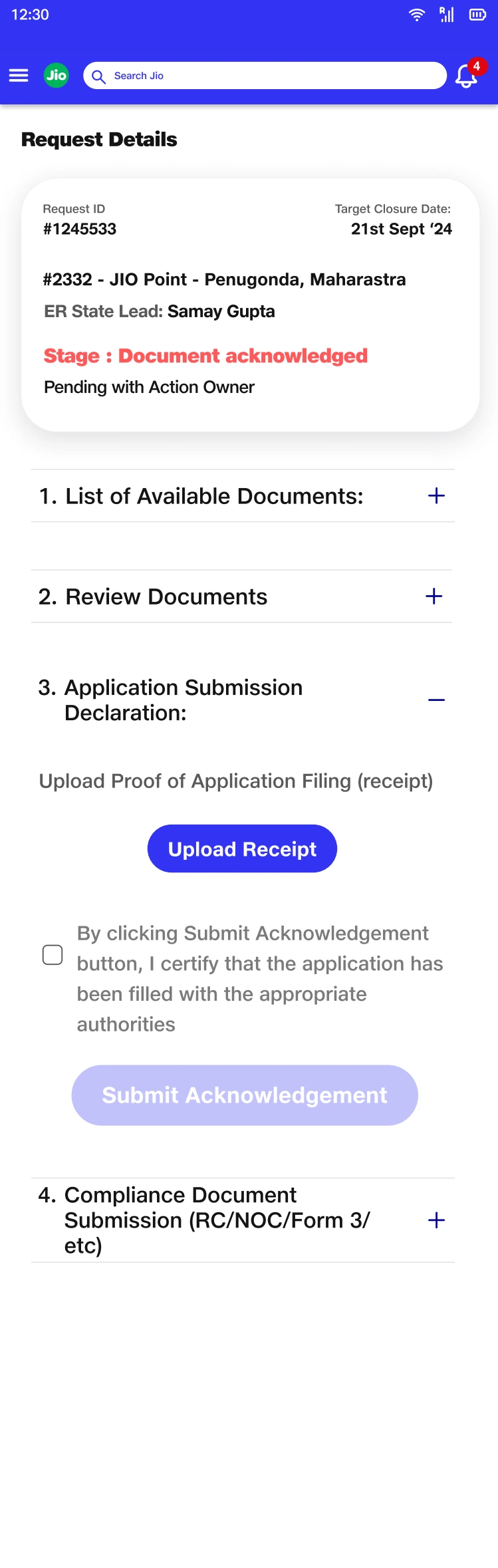
Filing evidence marks a distinct transition in the document lifecycle.
Action Owner.pdf · Design screen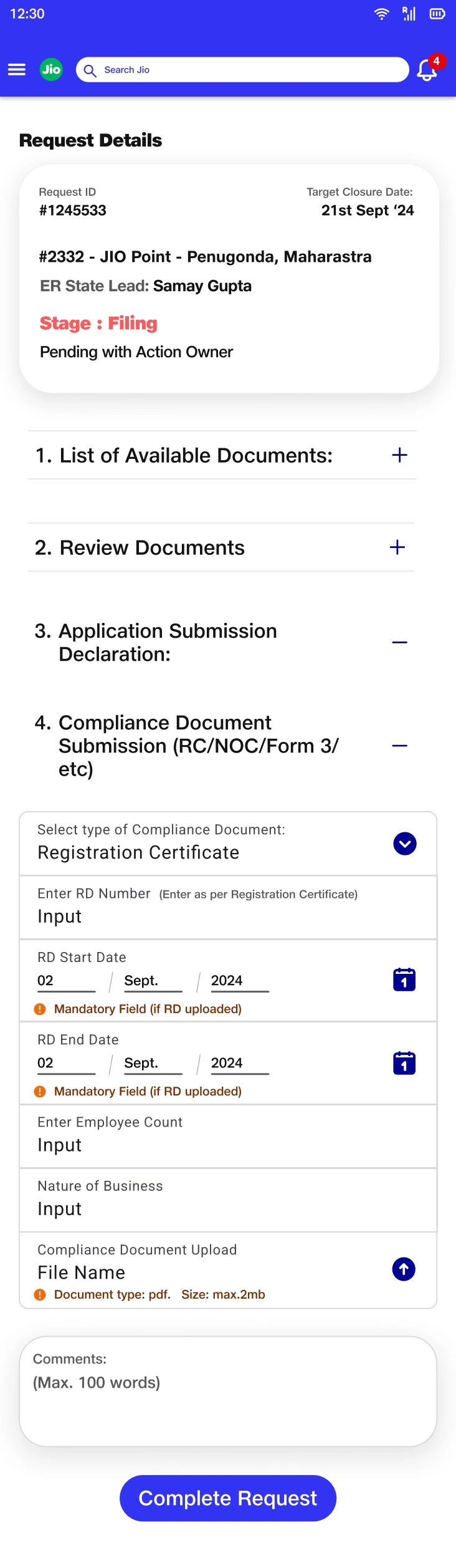
Final metadata ties the document back to the compliance record it supports.
Action Owner.pdf · Design screen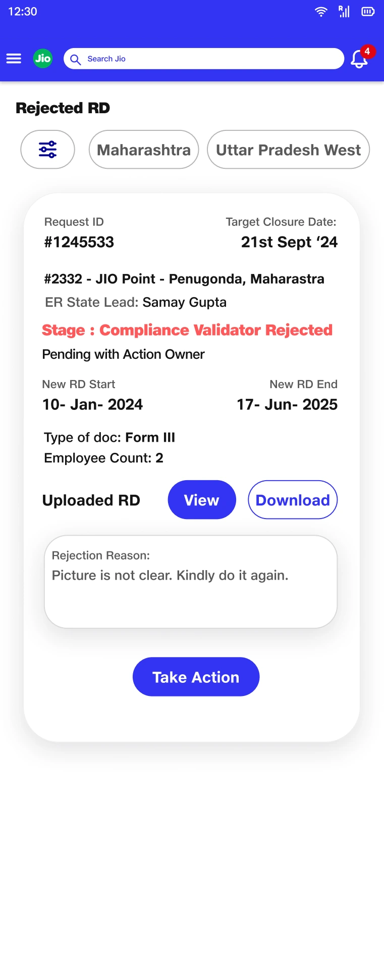
A reason and a route back to action make rejection recoverable.
Action Owner.pdf · Design screenIncomplete evidence needed a repair path, not just an error label.
The administrative designs address a different kind of uncertainty: some files may upload successfully while others are still processing or fail. A single batch-level status would obscure what the administrator needs to fix.
I used file-level feedback and a visible submission-ready state. At the record level, missing-document views connect the gap to a facility and an upload action. The same principle applies at both scales: identify what is incomplete and provide a route to repair it.
Keep failure local to the item that needs attention.
Individual upload states explain the batch condition, while the facility view gives missing evidence a clear owner context.
Tradeoff: More granular feedback adds visual detail. The status hierarchy must distinguish a file problem from the overall readiness of the package.
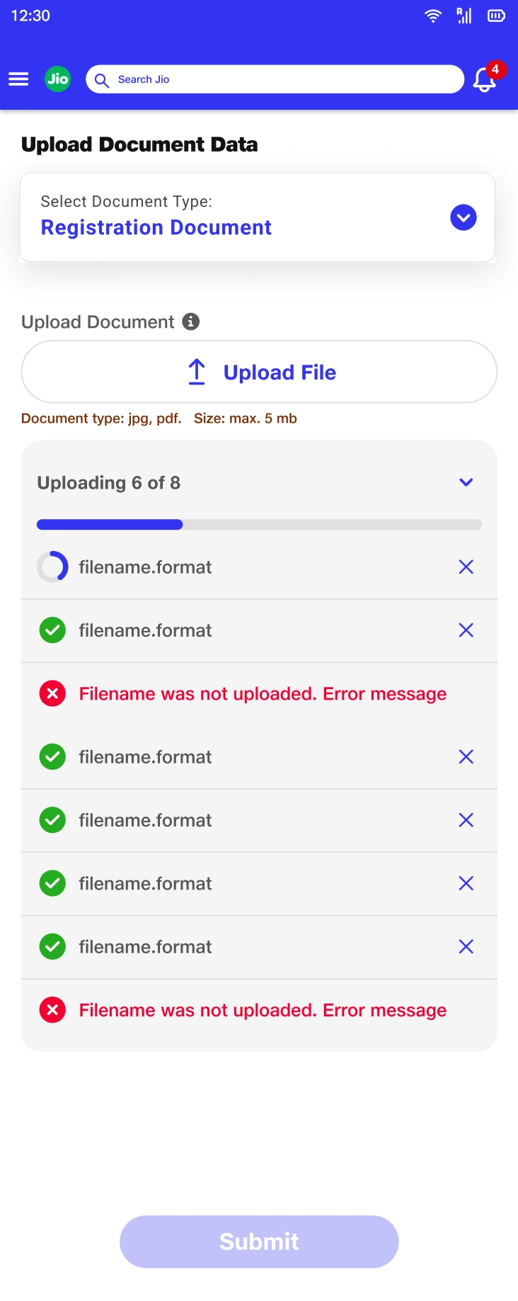
File-level feedback identifies the specific item that prevents the package from being ready.
Admin Screens.pdf · Design screen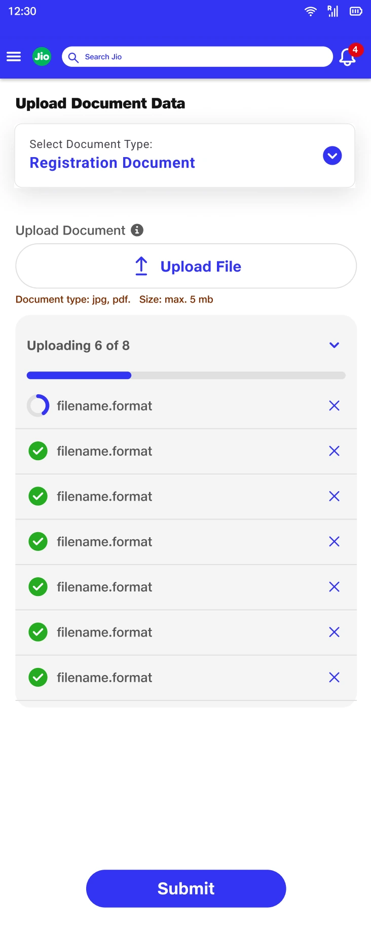
The enabled submission state communicates readiness after individual uploads resolve.
Admin Screens.pdf · Design screen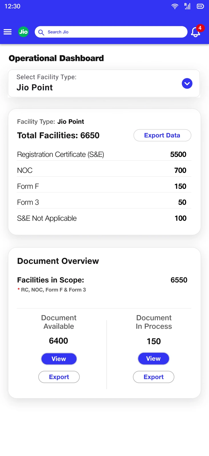
Available and in-process groups separate possession of evidence from work still underway.
Admin Screens.pdf · Design screen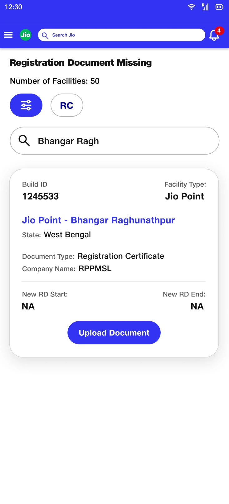
A missing record is linked to its facility and a repair action.
people first.pdf · Design screenManagement needed a different lens on the same system.
An operator’s next action and a manager’s assessment of exposure are different reading tasks. I designed the management view around risk categories rather than repeating the operational request queue.
The hierarchy moves from exposure to cause: missing or invalid registration evidence, then the reason behind that condition. Turnaround-time views add a process lens by separating work completed within and beyond the expected time.
Start with the risk, then reveal its cause.
The dashboard translates the detailed entity and state model into categories that can support prioritization.
Tradeoff: Aggregation removes individual context. Drill-downs are necessary so a count can be traced back to the records and changes behind it.
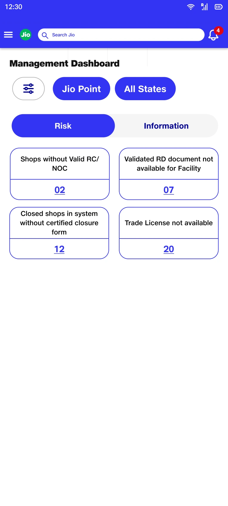
Risk categories recast the same underlying records for a management reading task.
Dashboard.pdf · Design screen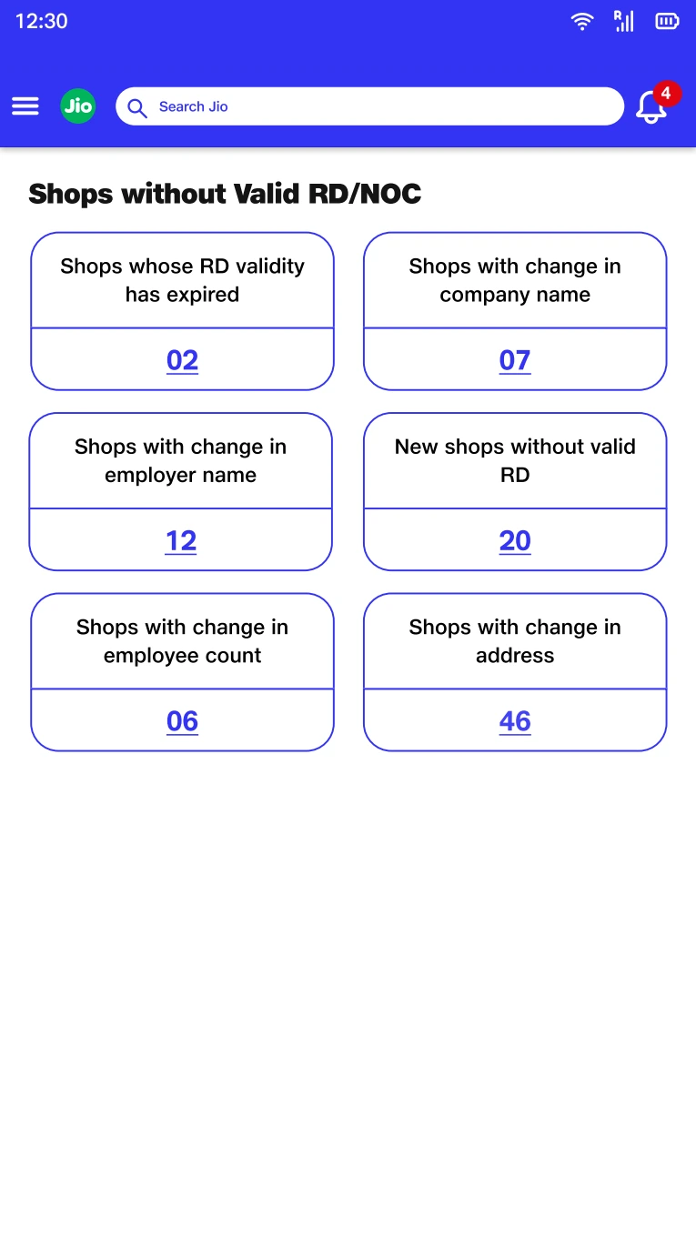
The drill-down preserves the causes that an aggregate count would otherwise hide.
Dashboard.pdf · Design screen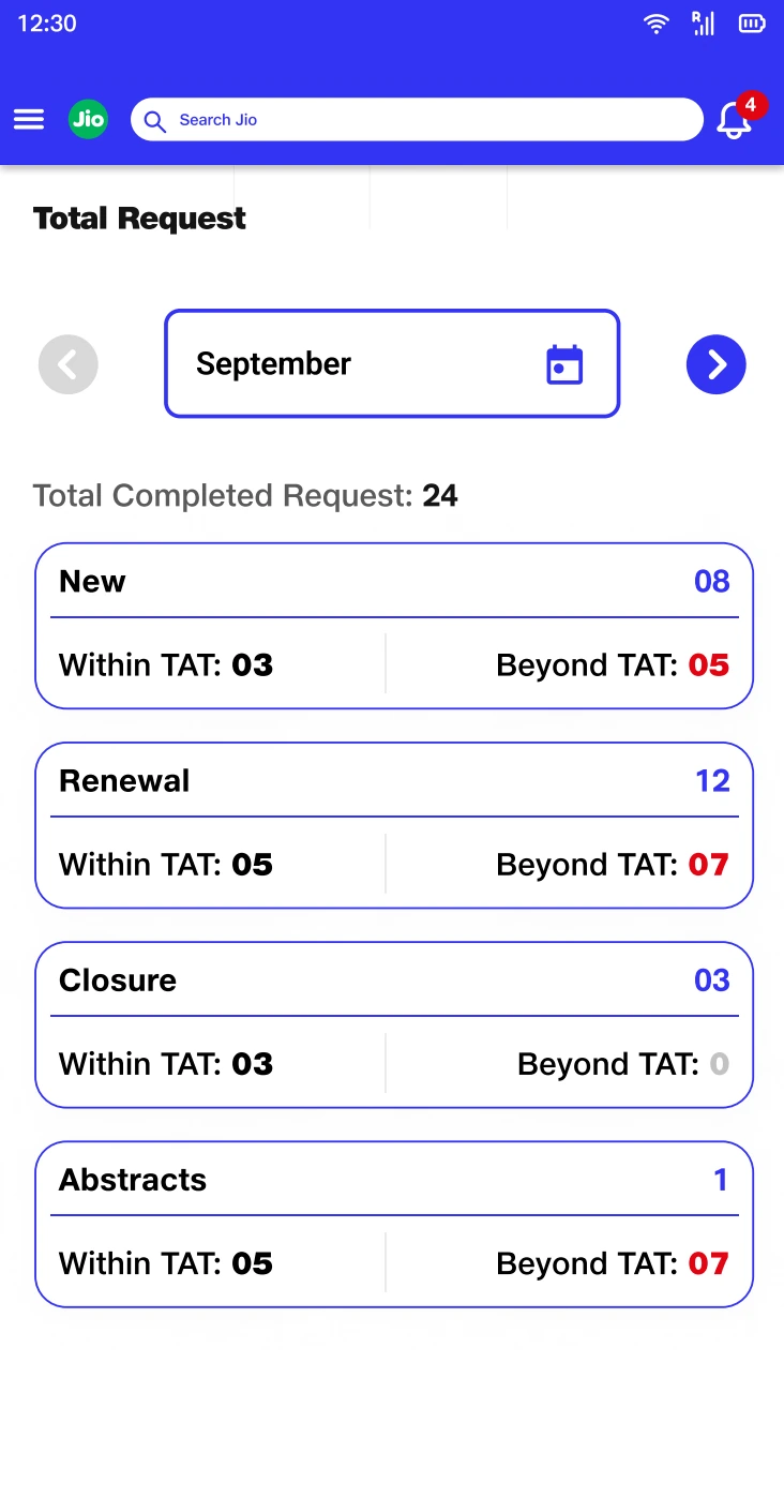
Completion within and beyond TAT adds a process view alongside compliance exposure.
Dashboard.pdf · Design screenThe model became clearer. The habits were harder to change.
Vishwas reached implementation, but adoption across the field compliance user base did not develop as intended. Operators and external agency partners continued using spreadsheets, WhatsApp, calls, and email follow-ups. The interface was only one part of a wider way of working.
That outcome changed how I judge the design. A coherent information model can reduce ambiguity inside the software without giving people enough reason or support to move their work into it. Existing channels also carry relationships, familiarity, and informal coordination.
If I revisited the project, I would make adoption an explicit design workstream: observe a complete facility case across tools, pilot one recurring workflow with field and agency users, and examine where people leave the system. I would use those findings to shape onboarding and handoffs before expanding the workflow.
My lasting learning was to pair systems thinking with the realities of use. Vishwas strengthened how I model data and states—and exposed the limits of treating a logically complete interface as a complete design solution.