CHECK-IN
From universal loyalty to merchant memberships.
Building a QR-based loyalty MVP taught me that a compelling network idea is not the same as a problem a business will change its behaviour to solve.
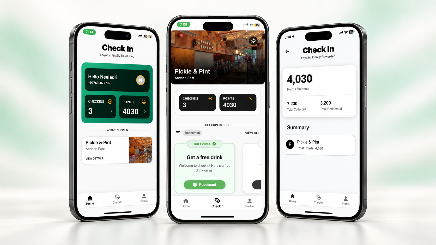
A functioning loyalty MVP: QR check-ins, OTP onboarding, profiles, points, offers and history, with merchant-facing experiences.
Merchants cared more about their own customer relationships than joining a universal rewards network.
A salon-first membership model, its customer and business flows, pricing hypotheses and merchant-led distribution.
A visit ends. The relationship shouldn’t.
Check-in began with a simple gap in offline commerce: a business could serve someone repeatedly without having a useful record of that relationship. Customer details lived in disconnected lists, rewards belonged to individual brands, and another loyalty app was a hard sell to customers.
Our first thesis was one loyalty identity across physical businesses. A customer could check in wherever they went; each visit would become part of a relationship that the business could recognize and encourage.
I worked on Check-in as a cofounder across product design and MVP development during 2023–2024. My involvement extended to customer and merchant experiences, merchant conversations, the pitch, and exploration of monetization and distribution.
Design the exchange of value, not just the check-in.
The customer needed an immediate reason to identify themselves: useful rewards and a record of their visits. The merchant needed something more meaningful than points issued: visibility into who returned and how they engaged. Both sides had to benefit from the same interaction.
From an anonymous walk-in to an identified customer.
We built a functioning loyalty MVP to make the thesis concrete. The central journey began inside a business, with a QR code, rather than asking someone to discover a network before they had a reason to use it.
- Scan at the businessThe physical QR connected the visit to a specific merchant and opened the onboarding flow.
- Verify an identityMobile OTP verified the phone number. The profile also collected name, email, date of birth and gender.
- Complete the first check-inA React Joyride walkthrough introduced new customers to the interface after their first successful check-in.
- See a reason to returnCheck-in counts, points and offers made the relationship visible; the profile preserved history across businesses.
Customer capture introduces friction at the most important moment.
OTP gave us a verified identity, but the broader profile form asked for effort before the customer had experienced much value. In retrospect, I would separate information needed to check in from optional information for personalization. That is a design lesson from the flow, not a claim that we tested and shipped progressive profiling.
Make loyalty legible after the scan.
The customer dashboard brought together visit counts, current points, points earned and redeemed, offers, and the merchant’s menu or services. Offers had distinct unlocked, redeemed and used states. Those distinctions mattered: access to an offer, claiming it, and actually using it are different moments.
The editable profile also acted as a cross-business history: places visited, check-ins, point additions and redemptions. The design idea was to give customers a continuous record rather than a collection of disconnected loyalty accounts.
We also created merchant/admin-facing experiences. The design challenge on that side was to make customer activity useful to an owner without asking them to interpret a complicated CRM.
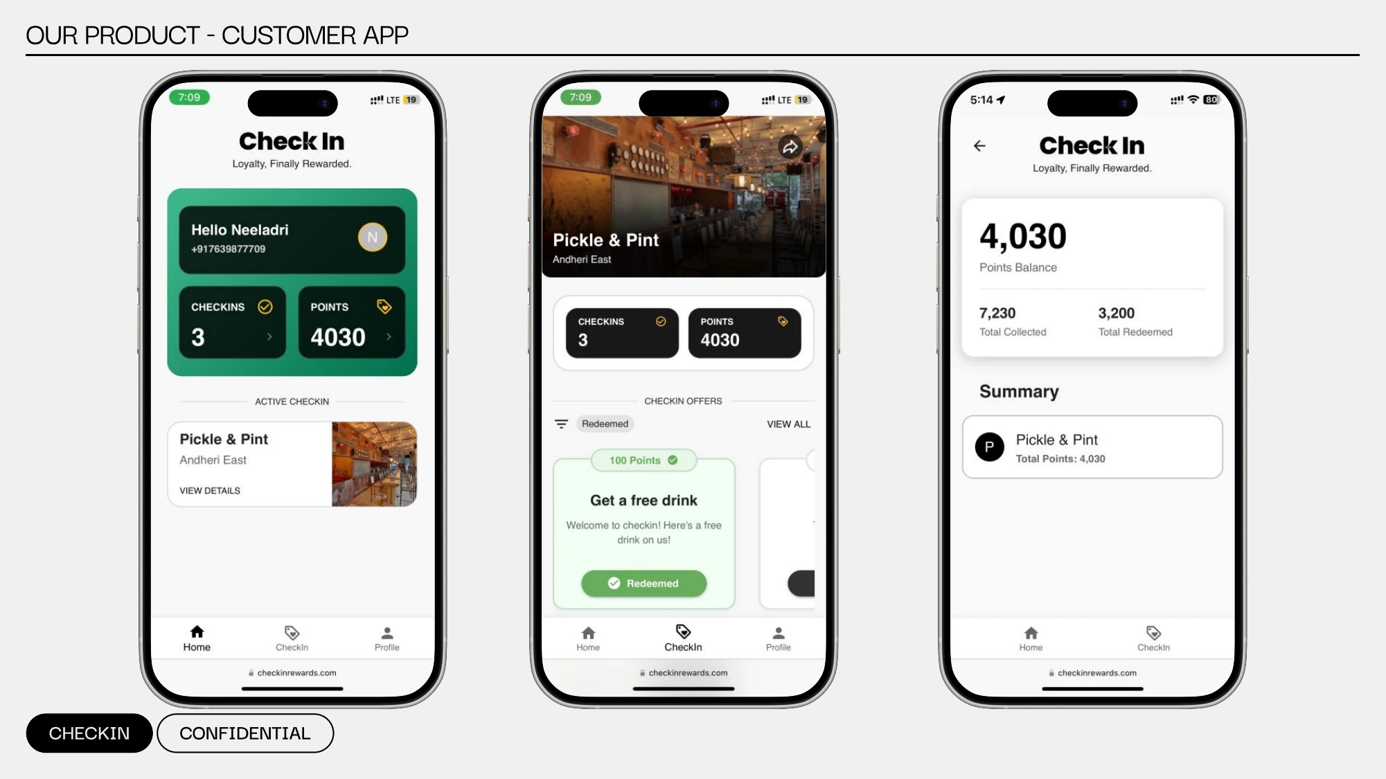
Customer interface shown in the September 2024 salon pitch deck, slide 9. This is an authentic later-stage presentation artifact; it is not a screen-by-screen record of the earlier MVP.
Separate the immediate task from the accumulated relationship.
The merchant view gives a visit its local context; the profile and history preserve the relationship over time. Points and offer states need to communicate what a customer can do now, while history explains how they got there.
The network was our idea. Retention was their problem.
Putting the product in front of merchants changed the question. We were describing a universal loyalty ecosystem. The owners we spoke to were more concerned with their own repeat customers, their own offers, and their own revenue.
This exposed a weakness in the horizontal model. A shared network needed both customers and merchants to find it useful at the same time. Meanwhile, the proposition for an individual business was still too abstract.
The important discovery was not a request for another feature. It was a different unit of value: help this business build an ongoing relationship with the customers it already serves.
Reframe the problem before expanding the feature set.
AI recommendations, gamification, segmentation and POS integrations belonged to the wider ambition. Adding them would not resolve the more basic question of why a merchant would introduce Check-in to customers. The next design direction had to make that reason clearer.
From universal rewards to a business’s own membership.
By September 2024, we were exploring merchant-controlled memberships, with salons as the concrete starting point. Salons offered a useful setting: repeat visit cycles, services that could be bundled, and benefits such as included treatments or priority appointments.
The new proposition was to help a business launch and manage its own branded plans. Instead of waiting for points to accumulate after transactions, a membership could make the value of returning explicit before the next visit.
Predictable recurring revenue and better retention were hypotheses behind this direction, not measured outcomes. The membership platform remained an evolving concept/prototype during the story documented here.
- Points → plansMove from an abstract balance toward a defined bundle of benefits.
- Visits → an ongoing relationshipMake duration, remaining benefits and renewal part of the design problem.
- Universal rewards → merchant controlLet the business define benefits that fit its services and customers.
- Consumer acquisition → merchant distributionUse the existing customer relationship as the starting point.
A plan is a promise the interface has to keep.
The membership direction introduced a new set of design responsibilities. A plan needed a price, duration, benefits, eligibility and usage rules. Customers needed to understand what they owned; staff needed to verify what could be used; the business needed a trustworthy record of what happened.
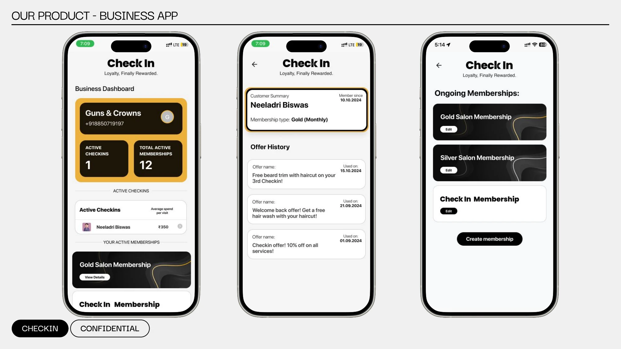
Merchant interface shown in the September 2024 salon pitch deck, slide 11. These screens communicate the membership direction; the deck alone does not establish that every depicted capability was implemented.
- Merchant consoleDefine tiers, prices, benefits and rules; make the offer clear enough to explain at the counter.
- Customer membership walletShow active membership, available benefits and what has already been used. A QR pass was part of the emerging concept.
- Staff redemptionVerify eligibility and record benefit use without making a busy service interaction cumbersome.
- A shared transaction historyPurchases, redemptions, expiry and renewal need a consistent record so customer and business understand the same state.
We also explored WhatsApp as part of administration and UPI, recurring payments and renewal flows. These were directions to investigate, not a list of shipped integrations. The underlying lesson was that small-business software has to fit existing habits, including messaging, calls and manual records.
Illustrative tiers around ₹299, ₹499 and ₹699 helped us think through benefit framing and willingness to pay. They were pricing hypotheses, not a validated business model.
Use the deck to open a conversation.
The salon pitch became a discovery artifact as much as a sales story. It framed the merchant’s challenges, showed the customer and business experiences, and proposed a follow-up process to understand requirements, develop and test with customers, and refine through feedback.
That gave us concrete questions to take back to owners: would they offer memberships, which benefits would make sense, what would stop staff from using the system, and what would a useful pilot look like?
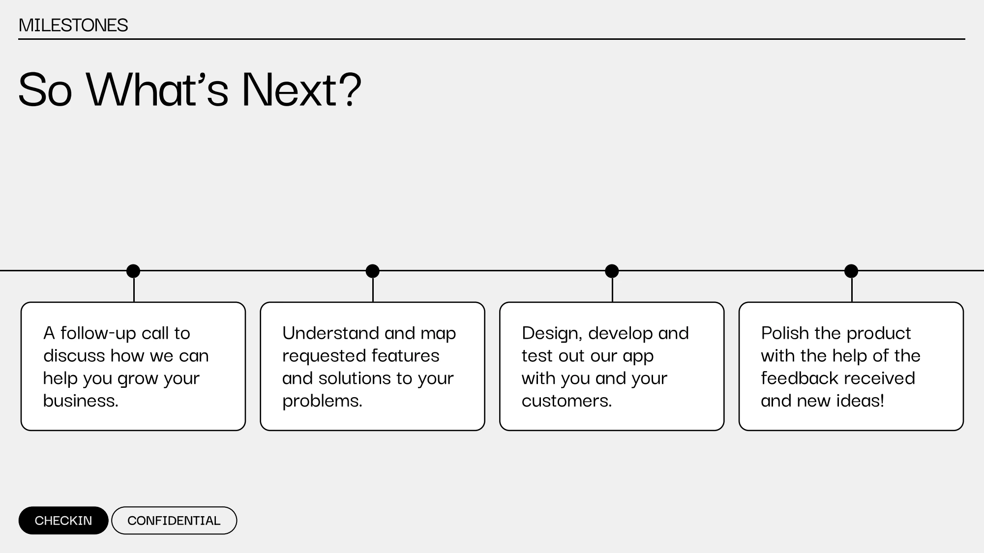
September 2024 salon pitch deck, slide 12. The roadmap describes intended next steps, not completed testing or a successful pilot.
A prototype should invite a useful disagreement.
Showing membership and redemption flows gives an owner something specific to react to. The purpose is to find where the proposed workflow does not fit the business, rather than treating a polished presentation as evidence that the proposition is validated.
The merchant already has the audience.
The early GTM thinking ranged from referrals and local activations to merchant partnerships and POS integrations. The membership direction made the immediate path much more focused: win a merchant, then reach the customers already visiting that business.
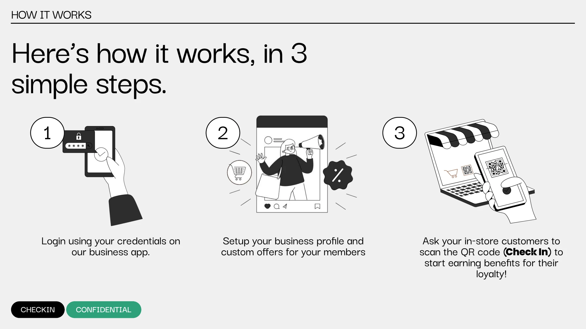
September 2024 salon pitch deck, slide 5. The merchant-led setup and in-store QR make the proposed distribution model tangible.
Merchant → existing customer → QR → membership.
The acquisition mechanism belongs at the point where the customer already understands the business and its services. This reduces the original dependency on convincing consumers to join a network before enough useful merchants are available. It still depends on staff participation and a compelling offer; the QR itself is not a growth strategy.
The biggest change was the question we were asking.
Check-in started by asking how one loyalty identity could work everywhere. It ended this phase asking how a specific business could give its customers a clearer reason to return. That shift changed the product, the interface and the distribution strategy together.
- Start with a concrete business problem. “Help this salon turn repeat customers into members” is easier to design and discuss than a universal loyalty network.
- Distribution is part of the experience. The owner’s willingness to introduce the product and the staff’s ability to explain it matter as much as the customer dashboard.
- Make the incentive understandable. Points can be abstract; a membership makes benefits explicit, but also creates obligations around usage, expiry and trust.
- Match the operating reality. A polished console only helps if it fits the way a small business actually works.
The tangible outcome was a working loyalty MVP, customer and merchant interfaces, and a more focused membership direction informed by merchant conversations. I do not present this as product-market fit, proven revenue, scaled adoption or a completed successful pivot. The value of the project is the evidence of building, listening and changing direction.